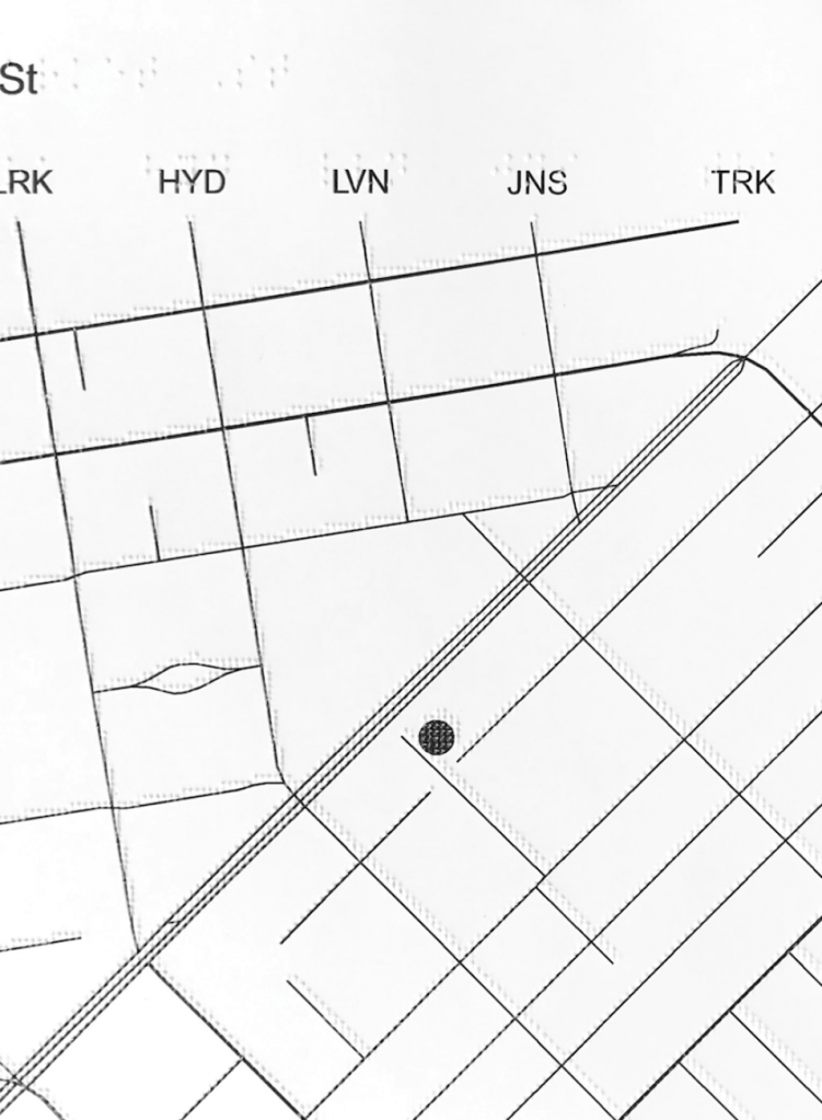
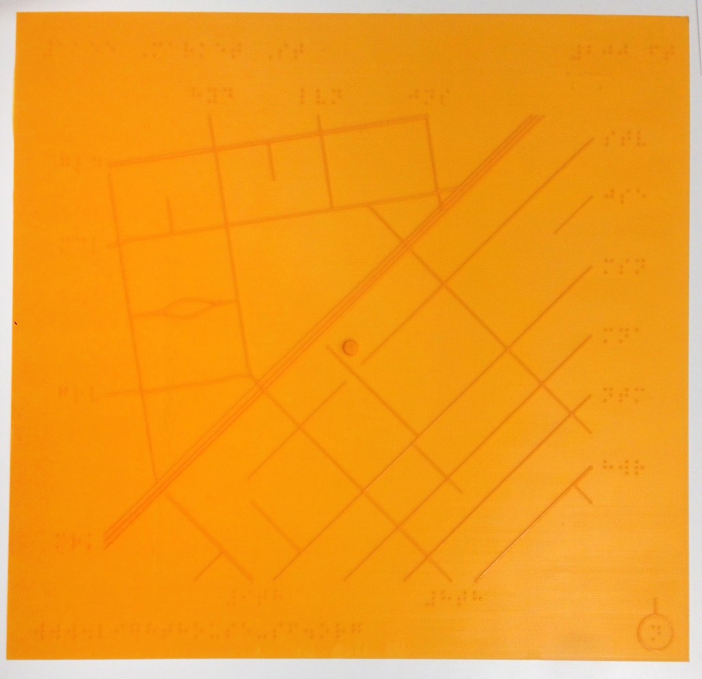
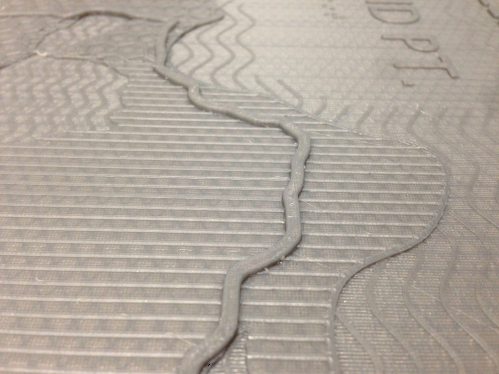
In designing tactile maps, we use similar methods as one would for visual maps. We use symbols, line types, textures and abbreviated labels to represent things in the real world, and we provide a legend so these things have meaning. In tactile design, we call it a key.
There are fairly set standards for how a key is laid out, and good reasons for it. For example, in a visual map, we often see the legend floating in a box over a less dense or less important area of the map. On a tactile map, this key would be confusing because it might closely resemble something else in the map, like a rectangular building with a bunch of things inside it. Also, knowing where to find the key is very important. While sighted users can quickly scan a map and find the key based on visual cues we’ve been learning for years, blind users shouldn’t have to explore the map just to find the key.
Reading and understanding 2D representations, maps, and diagrams is learned skill for everyone, sighted, blind, or low vision. As a sighted designer, it’s important to understand that most blind users won’t have had the exposure to graphic representation that I have, so simplifying is key.


