Tactile portrait of Frida Kahlo (UV printed) was on display at the de Young Museum in San Francisco, as part of Frida Kahlo: Appearances Can Be Deceiving. The tactile work was removed due to COVID safety.
Design Reflection: Frida Kahlo
I selected this image for tactile graphic production for its content as well as context. As a photograph, it requires significant interpretation on the part of the designer, including how to represent 3-dimensional shapes 2-dimensionally, and what to prioritize in terms of composition. An image of famous artist Frida Kahlo, this photo presents an entry into the art world that is often quite limited to BVI audiences. Kahlo’s self-portraiture is a prominent theme in her work, and so a portrait of the artist, taken by her father, offers an introduction to her (visually) well-known features.

microcapsule paper, outlines, labels 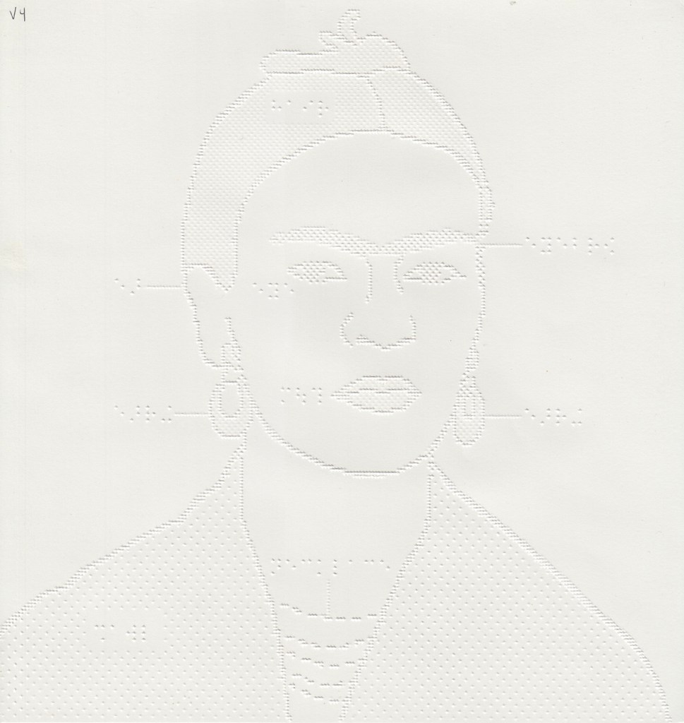
embossed paper, outlines, labels 
microcapsule paper, light-dark 
embossed paper, light-dark 
UV printed, outlines (no labels) 
UV printed, outlines, labels
Frida Kahlo: outlines and labels (embossed paper, microcapsule paper, UV-printed)
I mostly used outlines to represent the main features on this image. In order to give context to the unfilled areas (skin vs. blank page outside figure) I added texture to the hair and shawl. I also added texture to emphasize specific features: eyes, hair/eyebrows, lips, earrings. Though facial features represented by outline are fairly commonplace for visual representations, tactually, these lines may not be as straightforward. Why does a very 3-dimensional object, like a nose, get represented by a few squiggles? How do we choose those particular lines to outline a nose? Where does the nose end and the cheek begin? Why not represent the nose with a single line along its ridge, or a round shape at the tip? In following common line drawing conventions, this tactile graphic provides tactile viewers the opportunity to discuss the preceding questions, which many sighted viewers take for granted.
Because the outline method may not be entirely clear to a new tactile reader, I included labels for each feature, when they would fit, to give context. Though the nose is not labeled, the eye and mouth are labeled, so one can infer the nose location. I followed the recommendations in BANA Guidelines and Standards for Tactile Graphics to determine distances between labels, and use of lead lines.
I chose to crop this image to enlarge Frida Kahlo’s facial features, omitting her shawl-covered chest and part of hand. If the full composition is significant, this would ideally be shown with a smaller scale graphic showing the entire length of the photo.
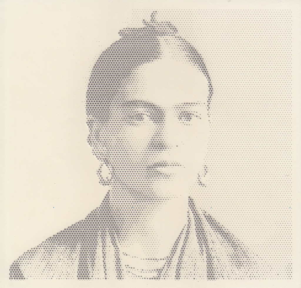
Frida Kahlo: light and shadow (embossed paper, microcapsule paper)
Though not a typical tactile representational choice, I thought this image had qualities that would translate well into a graphic showing lights and darks. The original photograph of Frida Kahlo, taken by her father, uses contrast and shadow to express emotion and depth. I think the use of light is a significant feature of the photo, and would be discussed in an art history course, or in viewing the image at a museum.
Of course, this dark/light composition provides little to the viewer in terms of feature recognition or social significance, but used in conjunction with a similarly scaled composition, it can offer insight that is difficult to describe verbally or through other drawing methods. If showing this to a tactile graphic reader, I would first present a labeled line drawing of the face for context.
In producing this for Swell paper, I knew I couldn’t use any solid fill, otherwise the dark areas would bubble. Instead, I opted for a dot pattern with varying dot size and spacing, where darker areas are represented by denser, larger dots, and lighter areas are represented by smaller, further spaced dots. This is similar to a heightfield effect, where dark is higher and light is lower.
Figuring out the process took a few hours, but it can be reproduced fairly quickly. In order to easily recognize the shades of grey in the image, I enhanced the contrast in a basic photo editing software (Photoshop or Preview on Mac). Then, in Illustrator, I use the Image Trace tool to make the image into vector shapes. I set it to greyscale, and chose to limit the number of greys to 5 or 6. Then, I edited dot pattern swatches to complete a gradient from dense to sparse, in a way that would work for Swell. I applied the dot pattern swatches to the grey shapes, dense dots for darker greys, sparse dots for light greys, and everything in between. On my first try through the swell machine, the most dense dot pattern bubbled, so shifted each grey pattern down one dot-density level.
